
[SwiftUI] Stack에 대해
🪆 Stack 삼총사
들어가기에 앞서, 오랜만의 포스팅이라 사진이 엄청 크게 나왔다는 걸 몰랐다.
struct ContentView: View {
    var body: some View {
        VStack {
            Image(systemName: "globe")
                .imageScale(.large)
                .foregroundStyle(.tint)
            Text("Hello, world!")
        }
        .padding()
    }
}
프로젝트를 처음 만들면 위와 같은 소스코드가 자동으로 적혀진 채 파일이 생성된다.
VStack으로 Image와 Text 부분을 감싸고 있다.
이를 build해보면, 수직으로 Image, Text 순으로 보일 것이다.
Stack들은 view들을 감싸줄 수 있고, 각기 다른 역할들을 한다.
기본 예제에 가장 먼저 쓰인 VStack과 다른 Stack들의 특징이 무엇인지 아래에서 알아보자.
🤫 VStack
Vertical Stack 즉, 수직으로 정렬하는 스택이다.
실제로 텍스트 두개를 넣어봤다. 코드는 아래와 같다.
struct ContentView: View {
    var body: some View {
        VStack() {
            Text("Dongjun")
            Text("Jumy.dong")
        }
    }
}
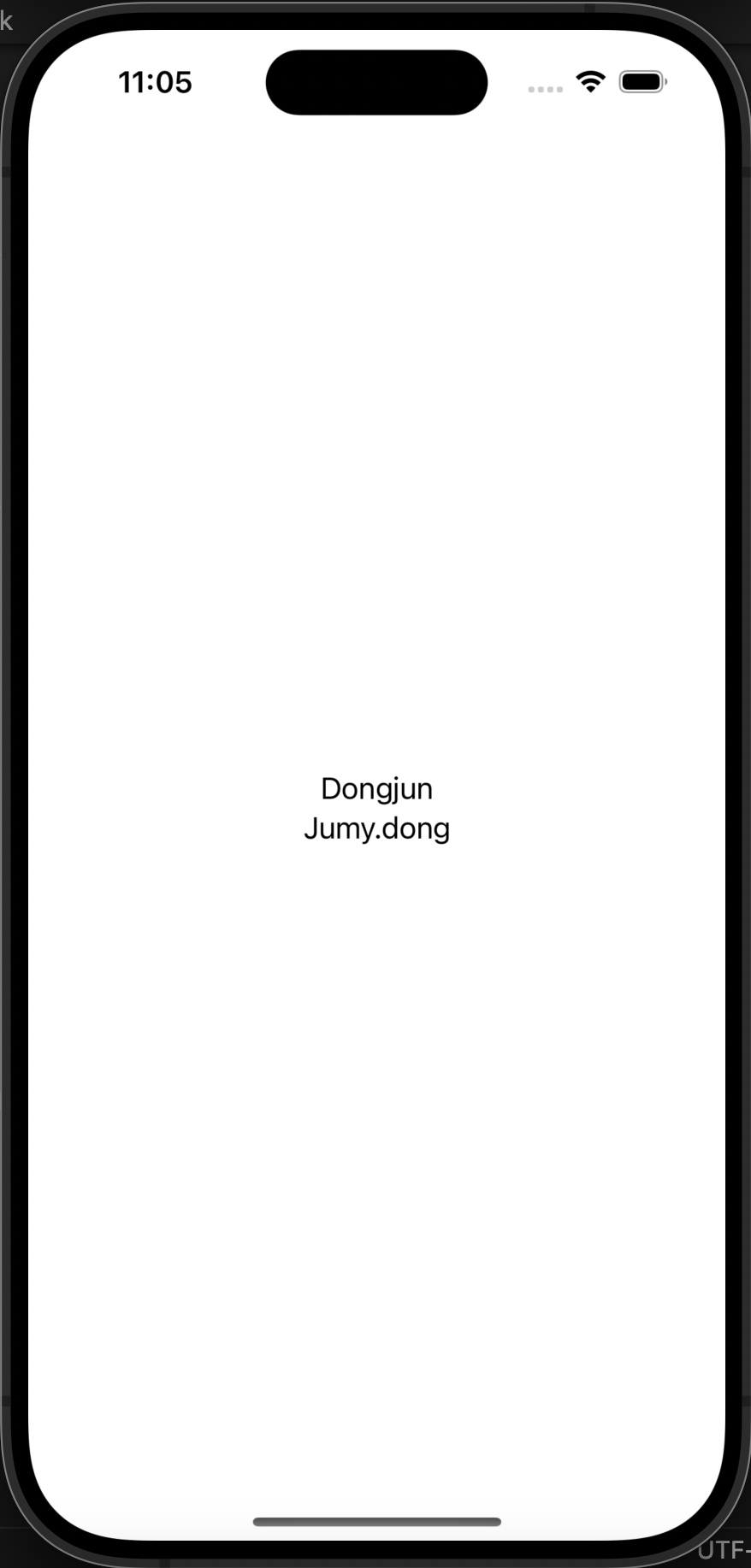
VStack은 2가지 옵션이 있다. alignment와 spacing이 있고, 그 중 alignment의 default값은 가운데 정렬이다.
그려줄 때 감싼 것 중 가장 큰 것의 크기에 맞추어 안의 View들이 정렬된다.
즉, Jumy.dong이 width가 더 길기 때문에 그걸 기준으로 width가 잡히고, 다른 View들은 가운데 정렬이 된다.
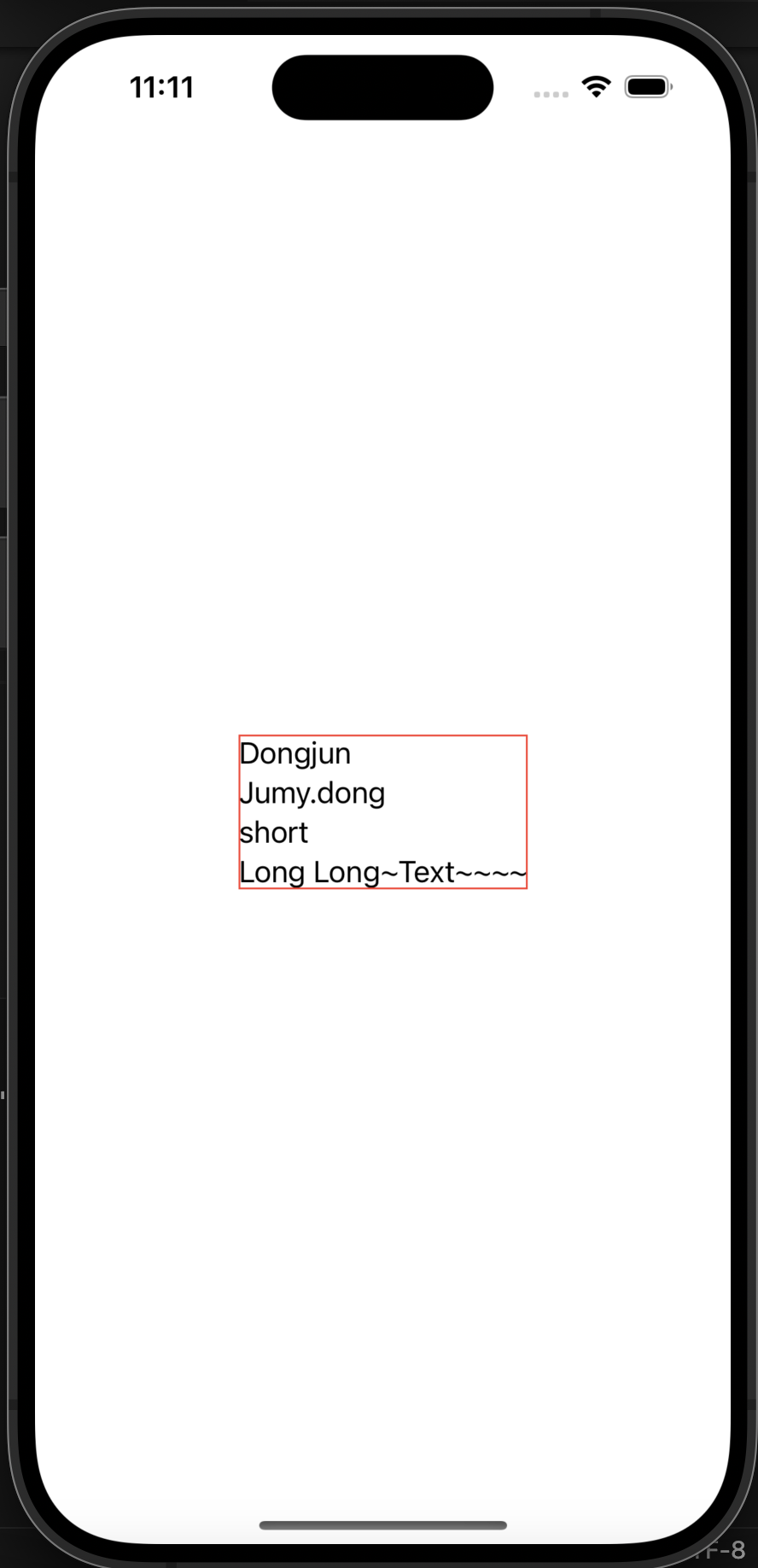
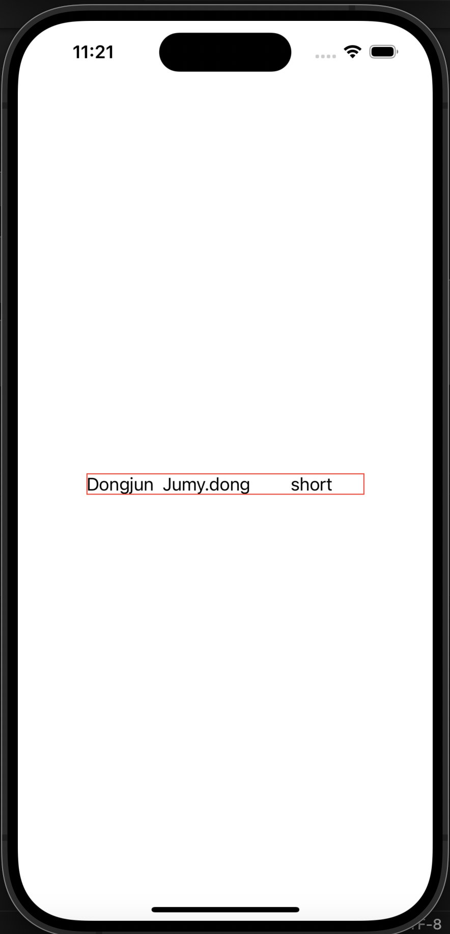
또한, VStack에는 .leading, .trailing 즉 왼쪽, 오른쪽 alignment 설정이 가능하다.
아래는 왼쪽 정렬이 된 모습이다. border는 조금 더 범위를 명확하게 보기 위해 그려주었다.
struct ContentView: View {
    var body: some View {
        VStack(alignment: .leading) {
            Text("Dongjun")
            Text("Jumy.dong")
            Text("short")
            Text("Long Long~Text~~~~")
        }.border(.red)
    }
}
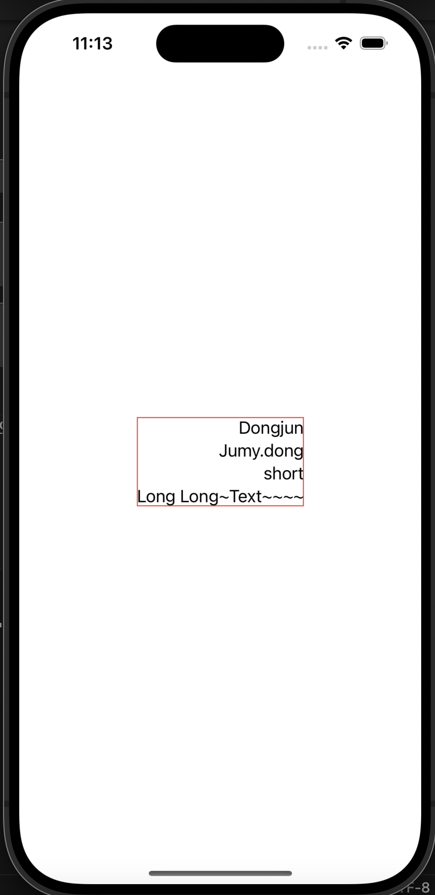
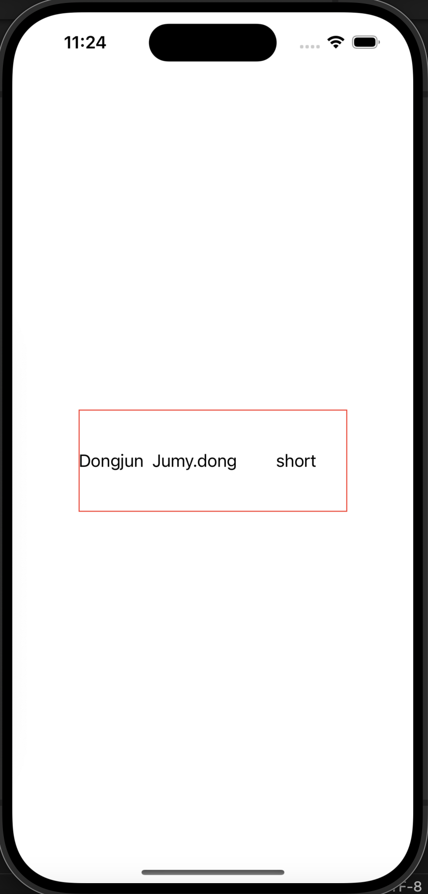
마지막으로 trailing으로 정렬해본 모습이다.
코드는 아래와 같이 Vstack의 alignment를 .trailing으로 바꾸어준 것 뿐 동일하다.
struct ContentView: View {
    var body: some View {
        VStack(alignment: .trailing) {
            Text("Dongjun")
            Text("Jumy.dong")
            Text("short")
            Text("Long Long~Text~~~~")
        }.border(.red)
    }
}
😒 HSTack
Horizontal Stack 즉, 수평으로 정렬하는 스택이다.
테스트를 통해 알아보자. 먼저 alignment 가 없는 default(center)부터
struct ContentView: View {
    var body: some View {
        HStack() {
            Text("Dongjun")
            Text("Jumy.dong")
            Text("short")
        }.border(.red)
    }
}
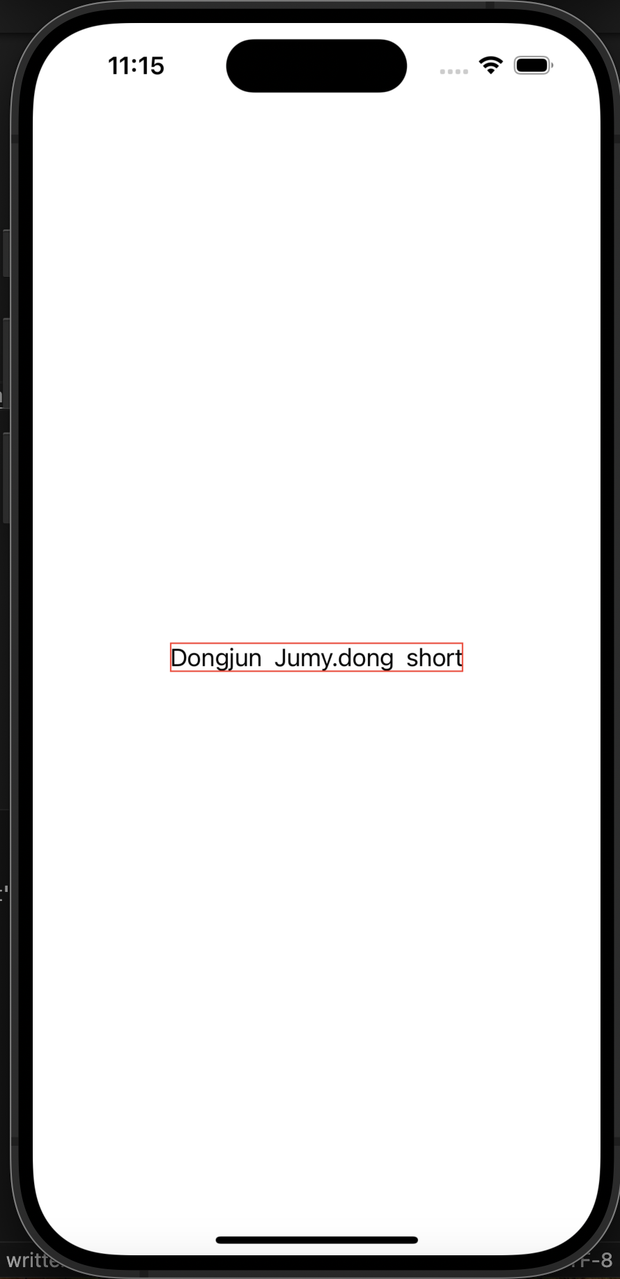
수평으로 텍스트 3개가 나열이 되고 있지만 이게 가운데 정렬인지 딱히 느낌이 없다.
마지막 텍스트에 width를 좀 줘보자.
struct ContentView: View {
    var body: some View {
        HStack() {
            Text("Dongjun")
            Text("Jumy.dong")
            Text("short").frame(width: 100)
        }.border(.red)
    }
}
가운데정렬이 되는 것이 보인다.
아까와 같이 이것도 가장 큰 view의 width, height에 HStack의 크기가 결정된다.
세번째 텍스트의 width가 길어짐에 따라 HStack도 같이 길어지는 것을 볼 수 있다.
그렇다면 위아래도 길어질까?
두번째 텍스트에 height 100을 줘보자.
struct ContentView: View {
    var body: some View {
        HStack() {
            Text("Dongjun")
            Text("Jumy.dong").frame(height: 100)
            Text("short").frame(width: 100)
        }.border(.red)
    }
}
이로써 HStack 안에 있는 view들의 최대 크기에 맞추어서 HStack의 크기가 딱 맞게 설정이 되는 것을 볼 수 있다.
HStack은 가운데 정렬 말고도, .top, .bottom 정렬도 가능하다.
alignment: .top 부터 실험해보자.
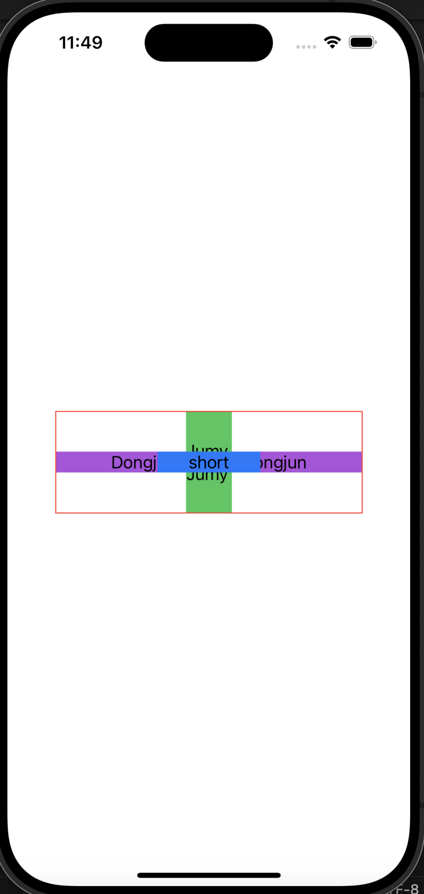
struct ContentView: View {
    var body: some View {
        HStack(alignment: .top) {
            Text("Dongjun").background(.purple)
            Text("Jumy.dong").frame(height: 100).background(.green)
            Text("short").frame(width: 100).background(.blue)
        }.border(.red)
    }
}
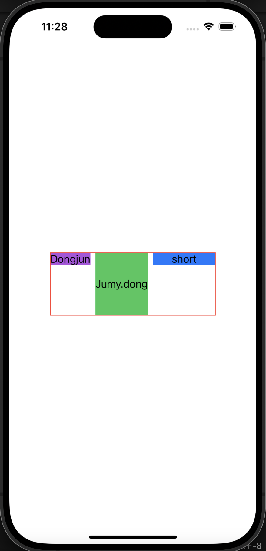
더 명확하게 보이고자, 각 텍스트들의 배경색을 넣었고,
위쪽 기준으로 정렬되고 있음이 검증되었다.
또한, height가 가장 큰 2번째 텍스트의 height 기준, 그리고 모두의 width를 더한 기준으로 HStack의 사이즈가 잡히는 것을 볼 수 있다.
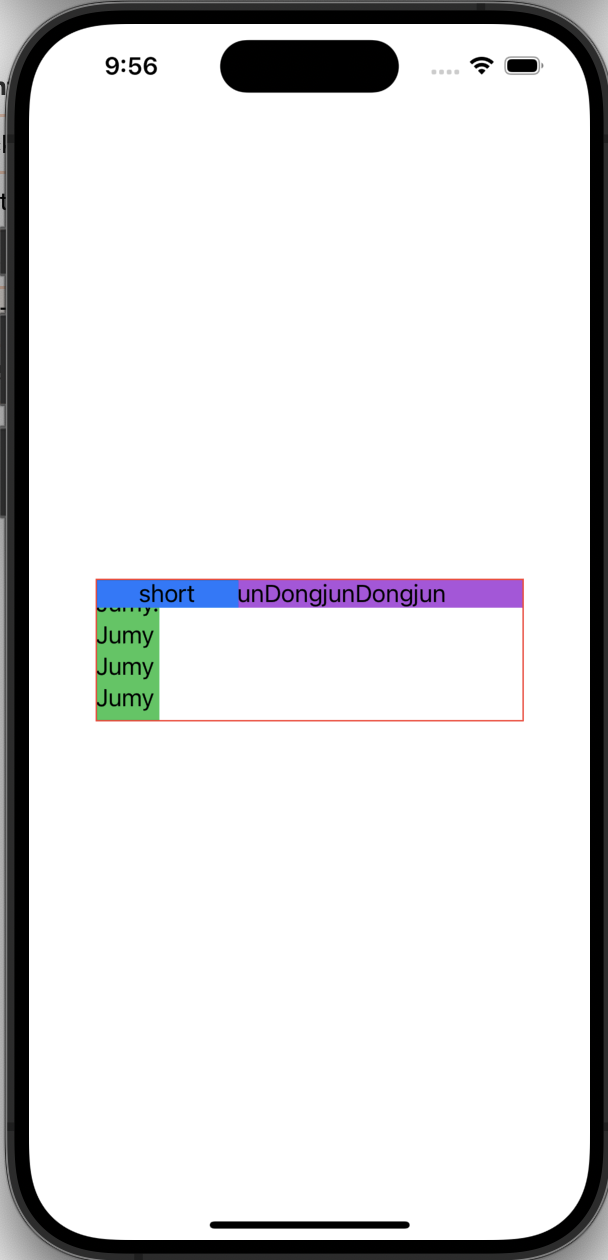
마지막으로 alignment: .bottom도 실험해보자. 밑으로 붙을게 딱 보인다. 또한 이제까지의 사진에선 각 텍스트가 조금씩 간격이 있는 것을 확인할 수 있었다.
이번에는 그 간격도 없애보겠다.
struct ContentView: View {
    var body: some View {
        HStack(alignment: .bottom, spacing: 0) {
            Text("Dongjun").background(.purple)
            Text("Jumy.dong").frame(height: 100).background(.green)
            Text("short").frame(width: 100).background(.blue)
        }.border(.red)
    }
}
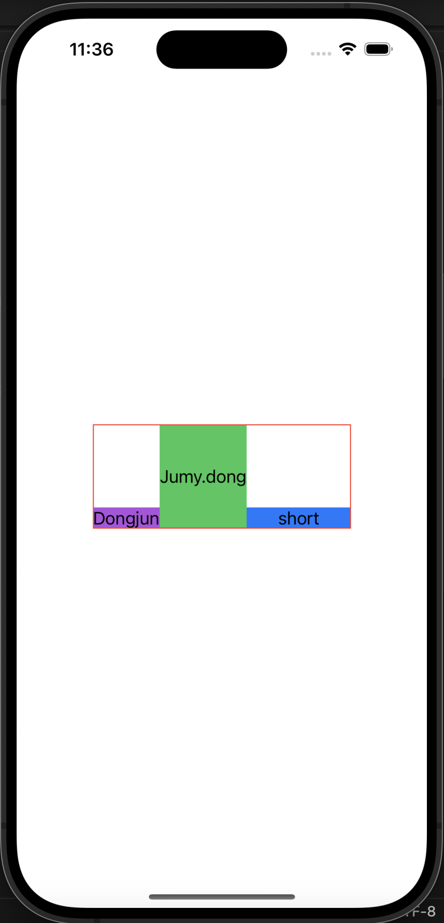
여기서 알 수 있는 것은 spacing:0을 넣어주면, view 사이 간격을 0으로 설정이 가능하다는 것이다.
😲 ZSTack
마지막으로 ZStack이다.
ZStack은 위로 쌓이는 스택이다.
Flutter의 Stack과도 같다.
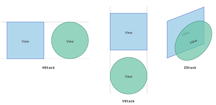
Apple Developer에서 ZStack을 설명하는 사진을 보자.
위에서 VStack, HStack 둘의 파라미터는 alignment, spacing이 있었던 것을 확인했다.
하지만, ZStack은 alignment 파라미터뿐이다.
그도 그럴게 위로 쌓이니 spacing은 사실상 필요가 없다.
느낌부터 보자. ZStack으로 3개의 길이가 다른 텍스트를 그려보겠다.
struct ContentView: View {
    var body: some View {
        ZStack() {
            Text("DongjunDongjunDongjun").frame(width: 300).background(.purple)
            Text("Jumy.\nJumy").frame(height: 100).background(.green)
            Text("short").frame(width: 100).background(.blue)
        }.border(.red)
    }
}
그림을 보면, 코드대로 첫번째 텍스트, 두번째 텍스트, 세번째 텍스트 순서대로 겹겹이 쌓인 것을 확인할 수 있다.
마찬가지로 default alignment는 .center이다.
ZStack에는 alignment가 좀 많다. 9개나 있다.
아래 base code에서 ZStack의 alignment부분 값만 바꾸며 실험해보자.
// baseCode
struct ContentView: View {
var body: some View {
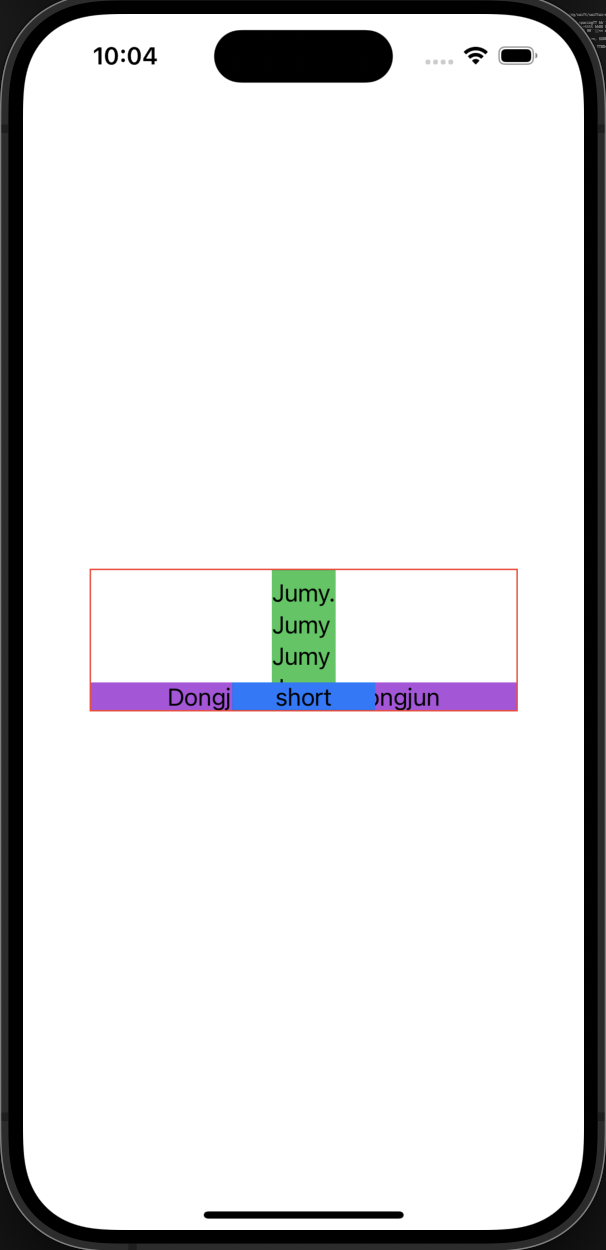
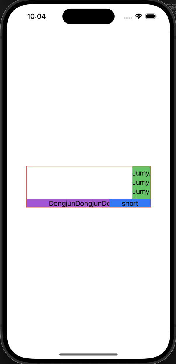
ZStack(alignment: .topLeading) {
Text("DongjunDongjunDongjun").frame(width: 300).background(.purple)
Text("Jumy.\nJumy\nJumy\nJumy").frame(height: 100).background(.green)
Text("short").frame(width: 100).background(.blue)
}.border(.red)
}
}
alignment: .topLeading : 왼쪽상단
alignment: .top : 위쪽
alignment: .topTrailing : 오른쪽상단
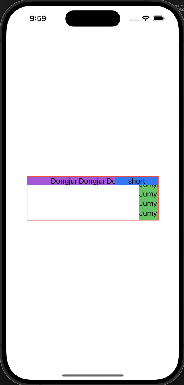
alignment: .leading : 왼쪽
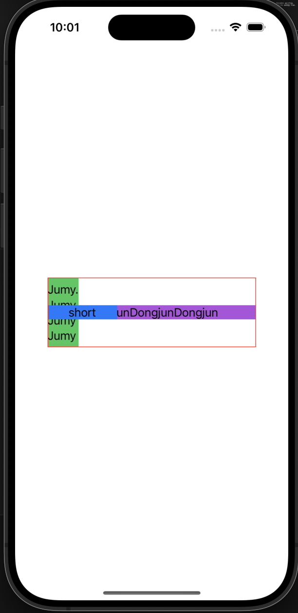
alignment: .center : 가운데
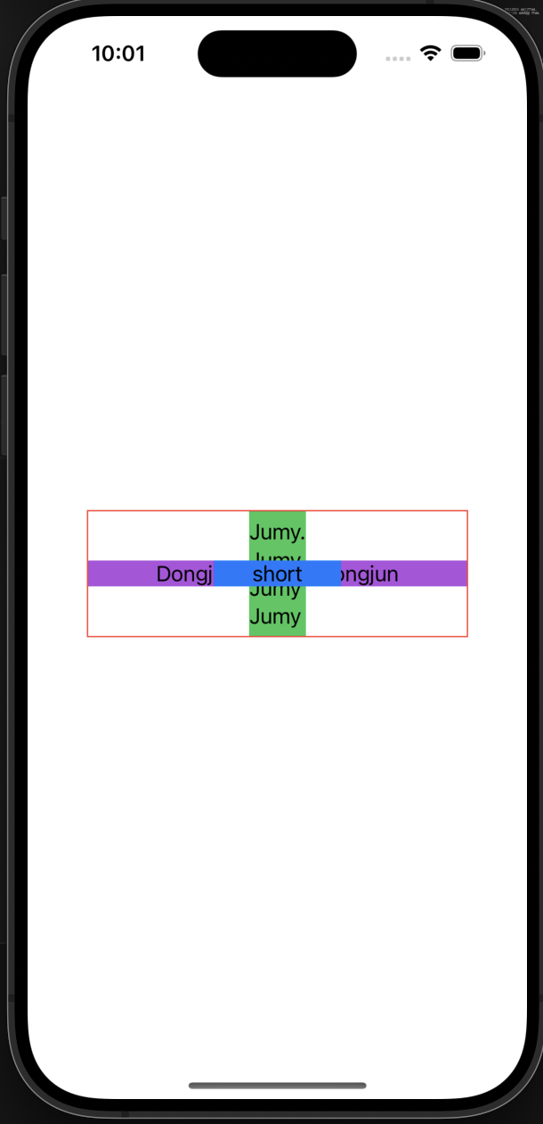
alignment: .trailing : 오른쪽
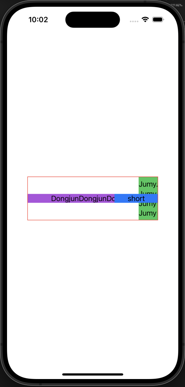
alignment: .bottomLeading : 왼쪽아래

alignment: .bottom : 아래
alignment: .bottomTrailing : 오른쪽아래
9개가 끝이 났다.
ZStack 역시 안에 있는 View들 중 가장 큰 것의 width, height 크기가 적용된다.
alignment 중에 TextBaseline에 따라 정렬되는 옵션도 있었다.
alignment: .trailingFirstBaseline : trailng을 하는데, 텍스트의 첫번째줄이 베이스 라인이 됨
이런 느낌이고, 때에 맞게 잘 사용할 수 있을 것 같다.
zIndex
ZStack과 함께 쓸 수 있는 zIndex는 각 View의 modifier로 달아줄 수 있고, zIndex(num)의 숫자가 클수록 최상단에 배치된다.
예제를 통해서 알아보자.
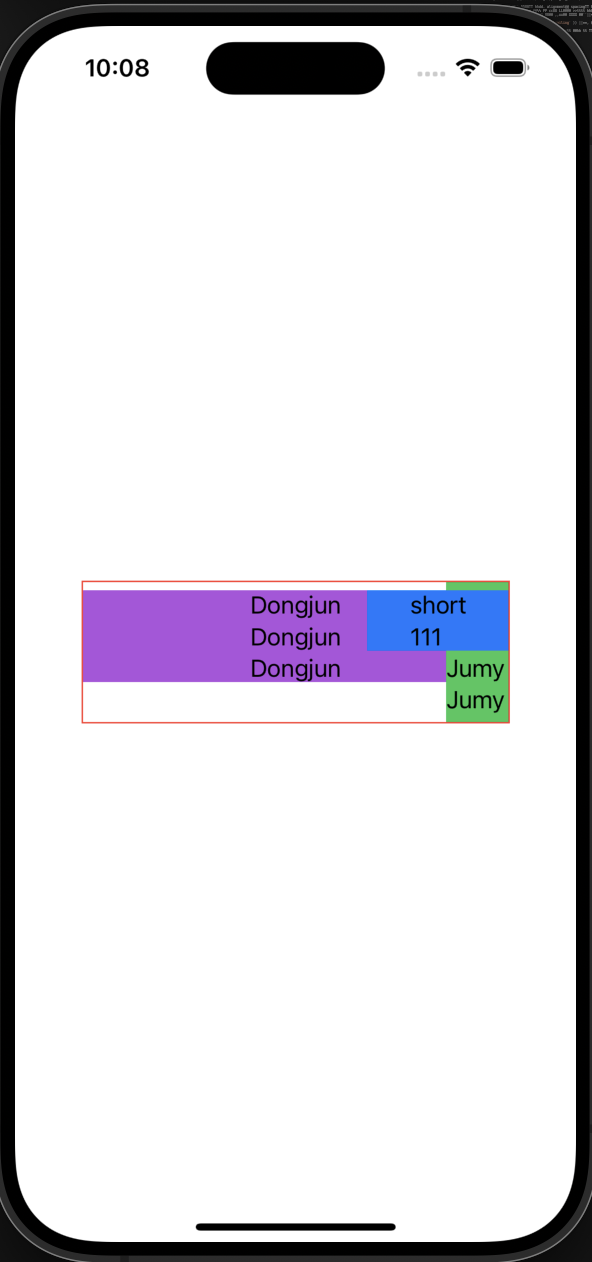
struct ContentView: View {
    var body: some View {
        ZStack {
            Text("123123111").frame(width: 250).background(.brown).zIndex(2)
            Text("Dongjun\nDongjun\nDongjun").frame(width: 300).background(.purple).zIndex(1)
            Text("Jumy.\nJumy\nJumy\nJumy1111111").frame(height: 100).background(.green)
            Text("short\n111").frame(height: 350).background(.blue)
        }.border(.red)
    }
}
원래의 ZStack이었다면, 쌓은 순서대로 보이겠지만, zIndex를 사용하여 우선순위를 정해주었고, 우선순위가 높은(숫자가 높은) View가 최상단에 배치된다.
📖 정리
ZStack, HStack, VStack 의 default alignment는 .center이다.
ZStack에는 spacing이 없고, HStack, VStack에는 spacing을 설정할 수 있다.
그림과 같이 ZStack은 위로 쌓이고, HStack은 수평, VStack은 수직으로 쌓인다.
zIndex를 활용하여 ZStack에서 최상단에 쌓이는 순위를 매겨줄 수 있다!
Leave a comment